Hollywood Walk of Florals
My Role: Product Design, UX Design, Visual Design, Research
Project: Personal
Timeline: 4 weeks, March-April 2021
Tools: Figma, Miro, Illustrator, Google Sheets
INTRODUCTION
Imagine:
You’re a small business owner and need to send “thank you” flowers to multiple clients, but you don’t have time to go to the flower shop during business hours. You consider purchasing them through an app, but some worries pop into your mind:
Will there be accurate and understandable photos and descriptions of the floral arrangements?
Is there a “set-it-and-forget-it” option for future deliveries?
Could I set up profiles for business partners to reduce input time?
Wanting a more personal experience, you run to the local florist on your lunch break.
Project Brief:
I want a floral app that lets me choose from pre-made or customized seasonal arrangements, filters for allergies and pet/child-friendly options, and offers one-time or subscription purchasing models for faster re-ordering.
Outcome:
I created an application that focuses heavily on customer reviews and photos and allows users to create detailed relationship profiles with personal information, past purchases, and suggestions. To view the entire card deck presentation, press, tap, or click the button below!
My Role:
I created a floral purchasing and delivery app that helps users easily buy floral arrangements without visiting a brick-and-mortar shop. This was a personal project, so I did all of the UX research, unmoderated usability testing, wireframes, and visual mockups.
PROBLEM
Problem/Solution Summary:
There needs to be an accessible way for users to understand what different products are offered without looking through an exhaustive catalog of photos. There should be a straightforward way to filter information, read customer reviews, and save favored searches and products. There were five problems that needed to be addressed:
Problem #1- Confirmation Checkpoints:
Many users in the testing backtracked when there were fewer options to change or confirm their selections. The opportunity to make the most changes was on the final screen before placing the order.
Wireframe Version 1- Confirmation
Problem #2- Visual Design:
.Users wanted the buttons and nav menus to be more extensive and, therefore, easier to tap on multiple platforms. They also struggled to see products that had a few photos without specific details on smaller devices.
Wireframe Version 1- Menu Design
Problem #3- Word Choice:
Some of the wording used for menus/buttons were ambiguous or unclear.
Wireframe Version 1- Word Choice
Problem #4- Payment Fields:
Users wanted more fields and checkpoints to add, save, and edit payment information.
Wireframe Version 1-No Payment
Problem #5- Sign-In Integration:
Users wanted to have an account using their existing Google Account instead of managing a separate login.
Wireframe Version 2-Google Sign-in option
RESEARCH
Why research?:
I wanted to learn more about users' difficulties when purchasing flowers online instead of in person. I started with a competitive analysis, looking at direct and indirect floral competitors. Once my data was organized, I could see which products were more successful than others. I used that as the basis for my user study questions and flagged pain points I hoped to gather more information about from the usability test.
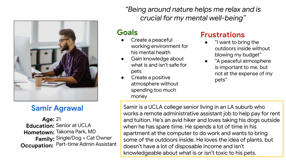
Personas:
From the competitive analysis data collected, I determined that our primary users are either business owners or professionals with limited free time between the ages of 21 and 55.
Primary:
Five participants were chosen for the unmoderated usability test based on the average age and professions identified during the competitive analysis. The analysis revealed product information, account set-up, customization, and scheduling pain points. The questions I wanted to address during the study were:
Are there parts of the checkout process difficult for users to navigate?
What do users learn about the products through reviews, descriptions, and photos?
How long do users take to browse through the catalog?
Does setting up a profile/relationship section reduce time spent purchasing products?
It was deemed essential to address these issues given that they are only digital pain points and not prevalent in a brick-and-mortar environment.
SKETCH
Based on what I thought was possible at the time, I made paper wireframes for the home screen and starred what I felt worked the best. I felt the layout and navigation on that page would make or break user’s desire to move forward or not.
I created initial digital wireframes in Figma but realized my check-out flow was missing some crucial elements, like a payment section! After studying the data and creating an affinity map, I made a second version of wireframes which included the payment section.
DESIGN
After testing, making changes from my affinity map and wireframes, I tested again and realized that my biggest concerns (product trust and accuracy) weren’t problems. Users stated that the actual photos were less important to them, and while reviews from others were helpful, they weren’t the main pain points. Lack of confirmation touchpoints where items could be added or edited, the ability to have information saved (Sign-in, favorite bouquets, personal information), and word choice were far more critical. They generally trusted that the product they would get was good quality.
Solution #1- Sign In Wording
Solution #2- Payment Information
Solution #3- Confirmation touchpoints
VISUAL MOCKUPS
Hi-Fidelity
This is a sample of the UI components, color palette, and typography for the app. The proposed UI styling includes vintage-inspired typography, vibrant photography, and simple CTAs.
FUTURE
If this were a real project, I would test the effectiveness of adding features like product suggestions and themed add-on items from other local shops that are not part of the already saturated market. For instance, I would consider items such as music, spa essentials, and books. I believe that such product combinations might appeal to a more personal and luxurious market, rather than just businesses


